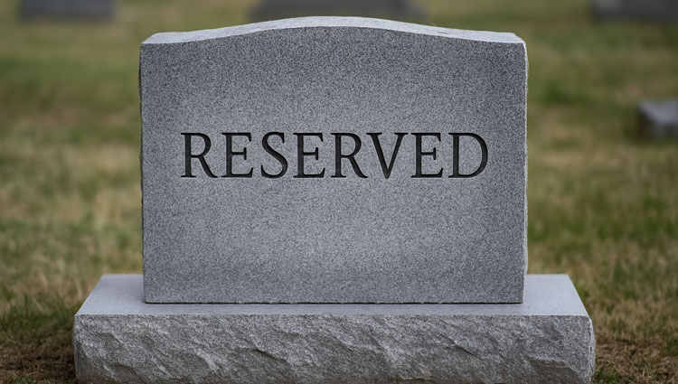
Legacy Giving Isn’t About Forms—It’s About Follow-Through Lately, you’ve probably seen the headlines: “Half a million wills created.” “Ten billion dollars committed.” The dashboards are slick. The numbers are impressive. And yet—most of those figures live in a world of promises, not payments. A donor can add your nonprofit to their will today, and yes, that feels like a victory. But here’s the hard truth: you might see that gift in 2045. Or you might never see it at all. That’s not cynicism. That’s planned giving reality. The Difference Between a Form and a Future I respect what the new digital platforms have built. They’ve made will creation accessible, even elegant. That’s a good thing. But a form is only the beginning of a much longer journey. Because what happens after the signature? I once worked with a nonprofit that proudly announced a $5 million “commitment.” Fifteen years later, they discovered